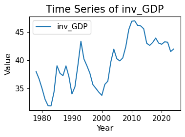
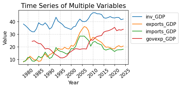
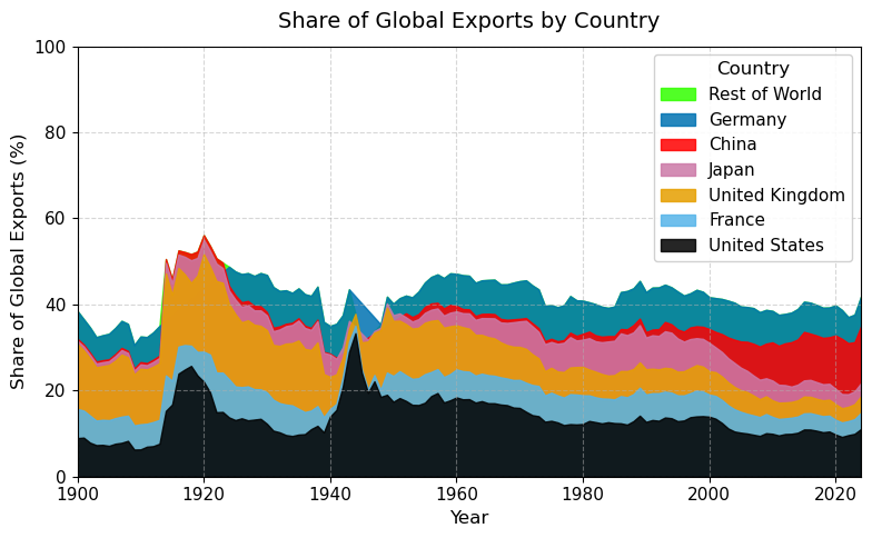
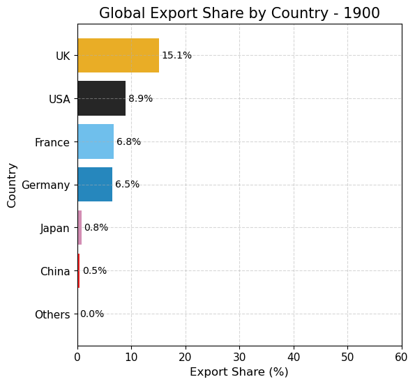
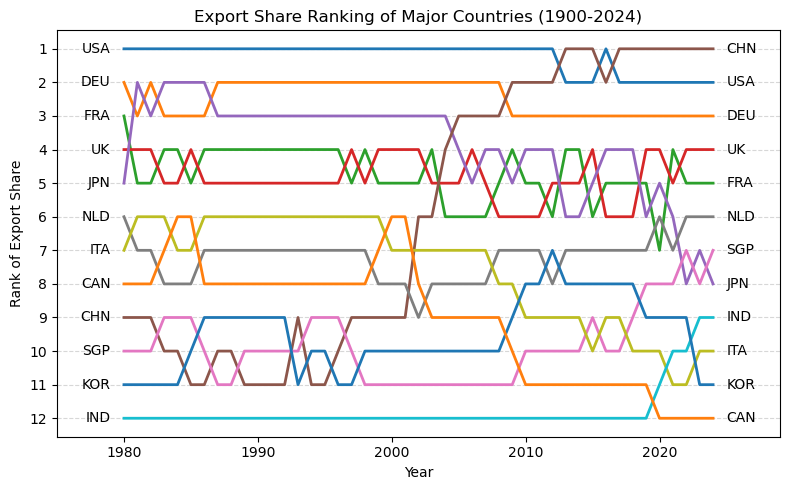
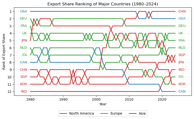
import pandas as pdimport matplotlib.pyplot as pltimport matplotlib as mplimport numpy as np# 读取数据 = pd.read_csv("data/GMD.csv" )# 主要国家列表 = ["USA" , "DEU" , "FRA" , "GBR" , "JPN" , "CHN" , "SGP" , "NLD" , "ITA" , "IND" , "KOR" , "CAN" ]= {"GBR" : "UK" = 1980 = 2024 # 地区分组与颜色映射 = {"USA" : "North America" , "CAN" : "North America" ,"DEU" : "Europe" , "FRA" : "Europe" , "GBR" : "Europe" ,"ITA" : "Europe" , "NLD" : "Europe" ,"CHN" : "Asia" , "JPN" : "Asia" , "KOR" : "Asia" ,"IND" : "Asia" , "SGP" : "Asia" = {"North America" : "tab:blue" ,"Europe" : "tab:green" ,"Asia" : "tab:red" # 计算出口占比 = data.copy()if "exports_USD" not in data.columns:"exports_USD" ] = data["exports" ] / data["USDfx" ]"total_exports" ] = data.groupby("year" )["exports_USD" ].transform("sum" )"export_share" ] = data["exports_USD" ] / data["total_exports" ] * 100 # 筛选数据 = data[data["ISO3" ].isin(cname) & (data["year" ] >= start_year) & (data["year" ] <= end_year)].copy()# 计算排名(1为最大) "rank" ] = rank_data.groupby("year" )["export_share" ].rank(ascending= False , method= "min" )# 绘图 = (8 , 5 ))for country in cname:= rank_data[rank_data["ISO3" ] == country]= country_region.get(country, "Other" )= region_colors.get(region, "gray" )= label_map.get(country, country)"year" ],"rank" ],= label,= 2 ,= color# 添加起止年份标签 if not country_data.empty:"year" ].min () - 1 ,"rank" ].iloc[0 ],= "center" , ha= "right" , fontsize= 10 ,= color"year" ].max () + 1 ,"rank" ].iloc[- 1 ],= "center" , ha= "left" , fontsize= 10 ,= color# 图形美化 # 排名 1 在顶部 1 , len (cname) + 1 ))"Year" )"Rank of Export Share" )"Export Share Ranking of Major Countries (1980–2024)" )- 5 , end_year + 5 )= "y" , linestyle= "--" , alpha= 0.5 )# 自定义图例(按地区) from matplotlib.lines import Line2D= [0 ], [0 ], color= "tab:blue" , lw= 2 , label= "North America" ),0 ], [0 ], color= "tab:green" , lw= 2 , label= "Europe" ),0 ], [0 ], color= "tab:red" , lw= 2 , label= "Asia" )= legend_elements, loc= "upper center" , bbox_to_anchor= (0.5 , - 0.15 ), ncol= 3 )