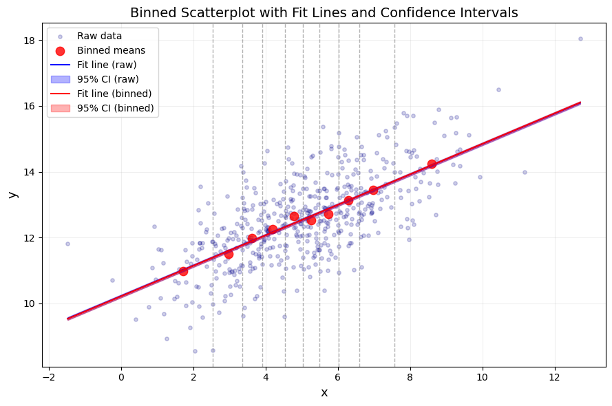
             Intercept       x
Raw    b        10.221   0.462
       se         0.12   0.022
       t        85.265  20.761
       P>|t|       0.0     0.0
       N           500
       R2     0.463953
Binned b        10.215   0.463
       se        0.107    0.02
       t        95.734  23.307
       P>|t|       0.0     0.0
       N            10
       R2     0.985486
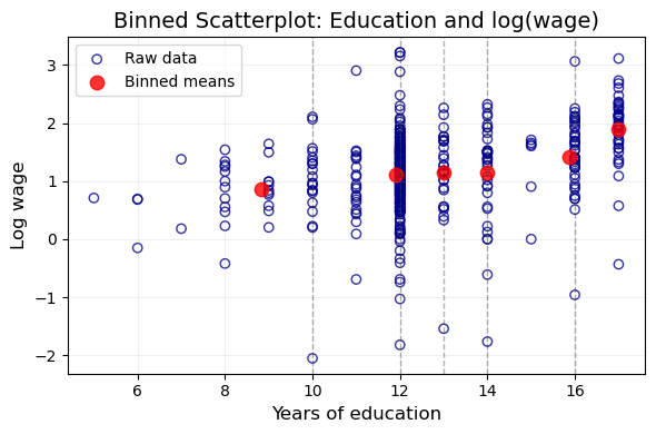
             Intercept   educ
Raw    b        -0.185  0.109
       se        0.185  0.014
       t          -1.0  7.545
       P>|t|     0.318    0.0
       N           428
       R2     0.117883
Binned b        -0.234  0.112
       se         0.36  0.026
       t         -0.65  4.247
       P>|t|     0.551  0.013
       N             6
       R2     0.818467
Source: Chernozhukov, V. & Hansen, C. & Kallus, N. & Spindler, M. & Syrgkanis, V. (2024): Applied Causal Inference Powered by ML and AI. CausalML-book.org; arXiv:2403.02467. -PDF-,Website, github → This Note
这些变量的定义可参考 CPS(Current Population Survey)文档和相关学术论文,例如:
Angrist, J. D., & Pischke, J.-S. (2009). Mostly Harmless Econometrics: An Empiricist’s Companion. Princeton University Press. Link, Google.
Card, D., & Krueger, A. B. (1992). School Quality and Black-White Relative Earnings: A Direct Assessment. Quarterly Journal of Economics, 107(1), 151–200. Link, PDF, Google.
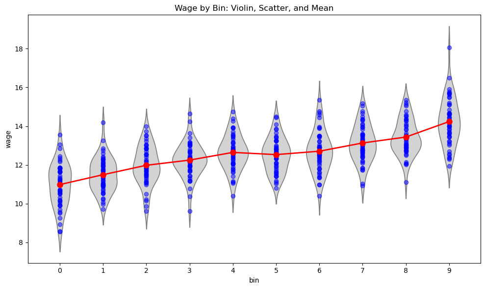
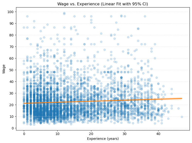
22.5.2 初步分析
import numpy as npimport pandas as pdimport statsmodels.api as smimport sklearn.linear_model as lmimport statsmodels.formula.api as smffrom sklearn.preprocessing import StandardScalerfrom sklearn.pipeline import Pipelinefrom sklearn.model_selection import train_test_splitimport warnings# ignore potential convergence warnings; for some small penalty levels,# tried out, optimization might not convergewarnings.simplefilter('ignore')
Cattaneo, M. D., Jansson, M., & Ma, X. (2022). binsreg: Estimating and validating binscatter estimators. The Stata Journal, 22(1), 65–99. Link, PDF, Google.
Cattaneo, M. D., Crump, R. K., Farrell, M. H., & Feng, Y. (2024). On Binscatter. American Economic Review, 114(5), 1488–1514. Link (rep), PDF, Appendix, Google, -Replication-.
Frisch, R., & Waugh, F. V. (1933). Partial Time Regressions as Compared with Individual Trends. Econometrica, 1(4), 387–401. Link, PDF, Google.
Lovell, M. C. (1963). Seasonal Adjustment of Economic Time Series and Multiple Regression Analysis. Journal of the American Statistical Association, 58(304), 993–1010. Link, PDF, Google.
Stepner M. Binscatter: Binned scatterplots in stata[J]. StataConference, 2014. -PDF-